
Meet the New WebOS Website Editor
NYN’s WebOS website content management system (CMS) brings AI-powered page building, easy content embedding, and responsive previews into one editing workspace. Create and update pages, add content through a single Insert menu, or drag and drop supported media directly into the editor. WebOS opens the appropriate options for the media you add, so you can fine-tune its settings before publishing.
Build Pages by Simply Describing Them
Tell WebOS’s built-in AI what you want, and watch your layout come to life in seconds. No coding, no design experience, no starting from scratch. It handles the heavy lifting so you can focus on your content.
Already have a page you want to update? Just tell the AI what to change—swap a layout, adjust spacing, or restyle a section—and it applies the update directly in the editor. Keep chatting and refining until the page looks the way you want.
A Cleaner, More Modern Workspace
The redesigned WebOS interface keeps your workflow focused and clutter-free. Its “what you see is what you get” (WYSIWYG) editor lets you work with text, images, video, and embedded content while reviewing your page layout.
Media tools support drag and drop, making it easy to bring supported files into your page. Drop in your media and WebOS opens the relevant settings, ready for you to adjust how it appears.
Add, Embed, or Drag and Drop Content in One Place
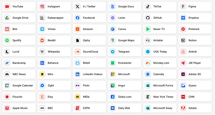
Add images, videos, documents, links, and supported third-party embeds directly in the WebOS WYSIWYG editor. Use the Insert menu to explore your options, or drag and drop supported media into the editor to get started right away.
WebOS brings up the appropriate options for the media you drop in, so you can fine-tune its presentation without hunting through separate menus. Bring videos, social posts, and other supported external content together with your own text and media—all in the same editing workspace.
Catch Issues Before You Go Live
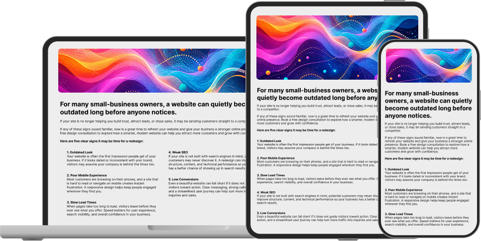
Spot spacing problems, awkward image crops, or text overflow before visitors see them. Review your layout and make adjustments before publishing, so your content is ready for different screen sizes.
See Your Site on Every Screen, Instantly
Switch between desktop, tablet, and mobile previews with a single click. Check how your text, images, and embedded content fit at different screen sizes directly inside WebOS, without opening multiple browser windows.